Responsive design, Store communications
Project Summary
Redesign of new website - Store finder and Store details pages
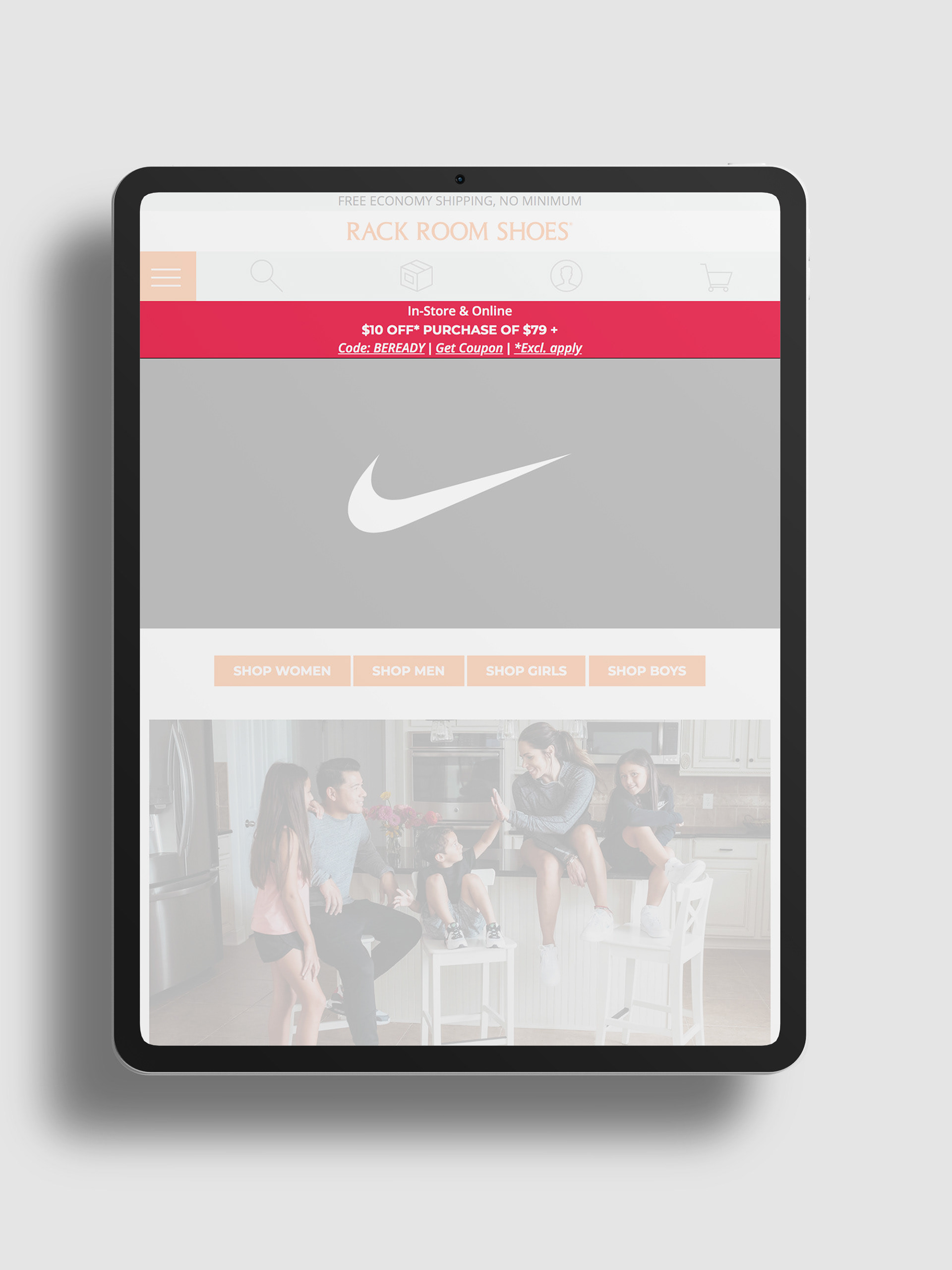
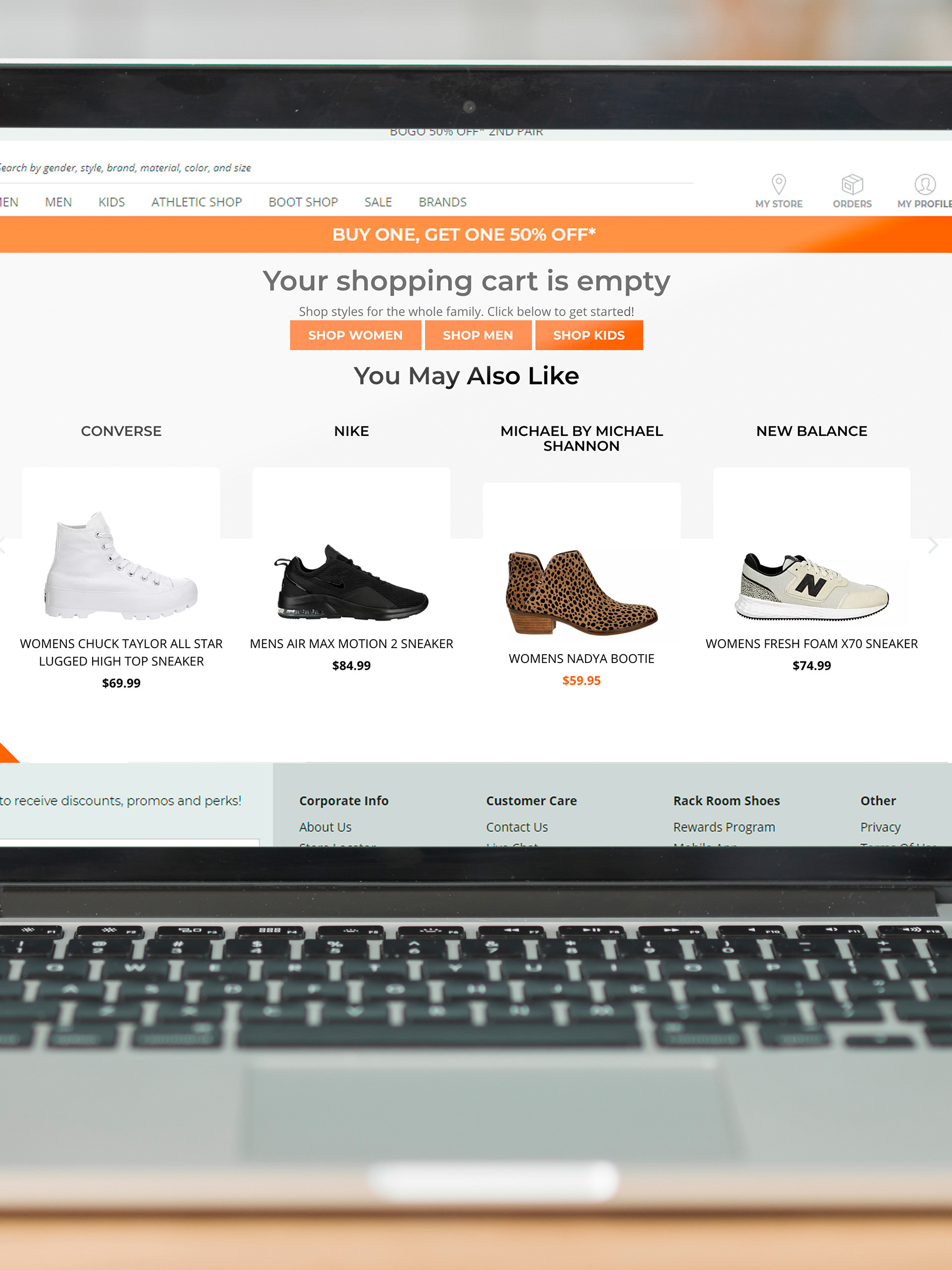
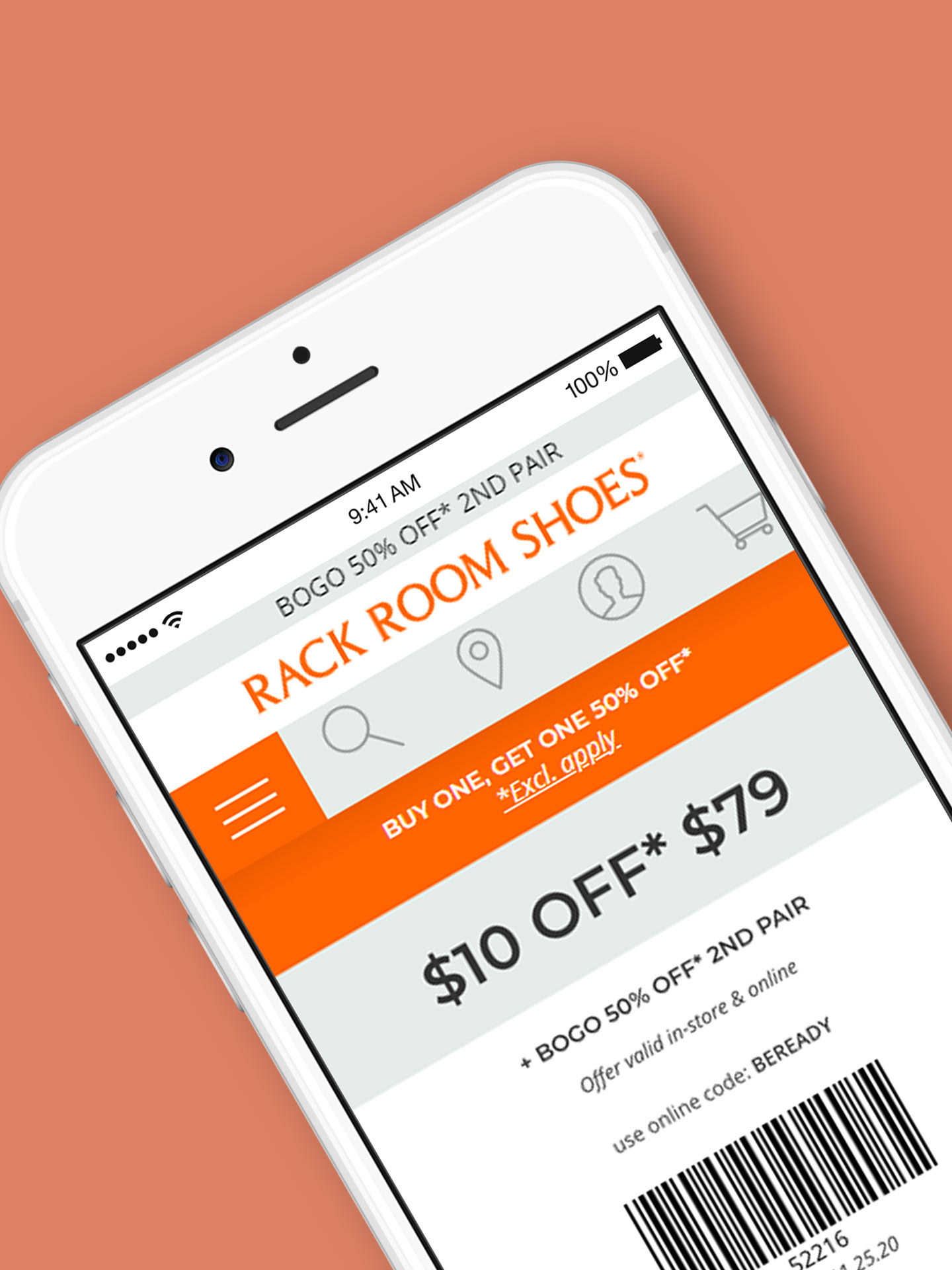
Prior to the redesign of the website, there was no dedicated space for promotional banner messaging built into the site. The design of these banners also took up a lot of page real estate with multiline messages which pushed down content of the page and thus took focus away from the product.
Messaging, messaging, messaging...
A recurring problem and concern at rack room was creating space for targeted and broadcast messaging for our marketing partners and sales teams. As well as providing a space that the back end developers could later hook up for store managers to display specific store hours and messaging - which was quite important as Rack Room Shoes is present in every mainland US time zone and in many different states across America. However we wanted to implement this within the design in such a manner that it blended well with a much larger display of the map for clarity and aesthetics.
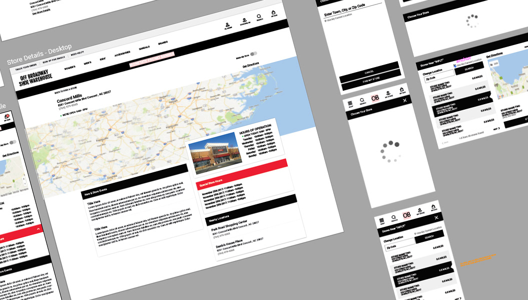
workfile for the OB version. Adobe Illustrator
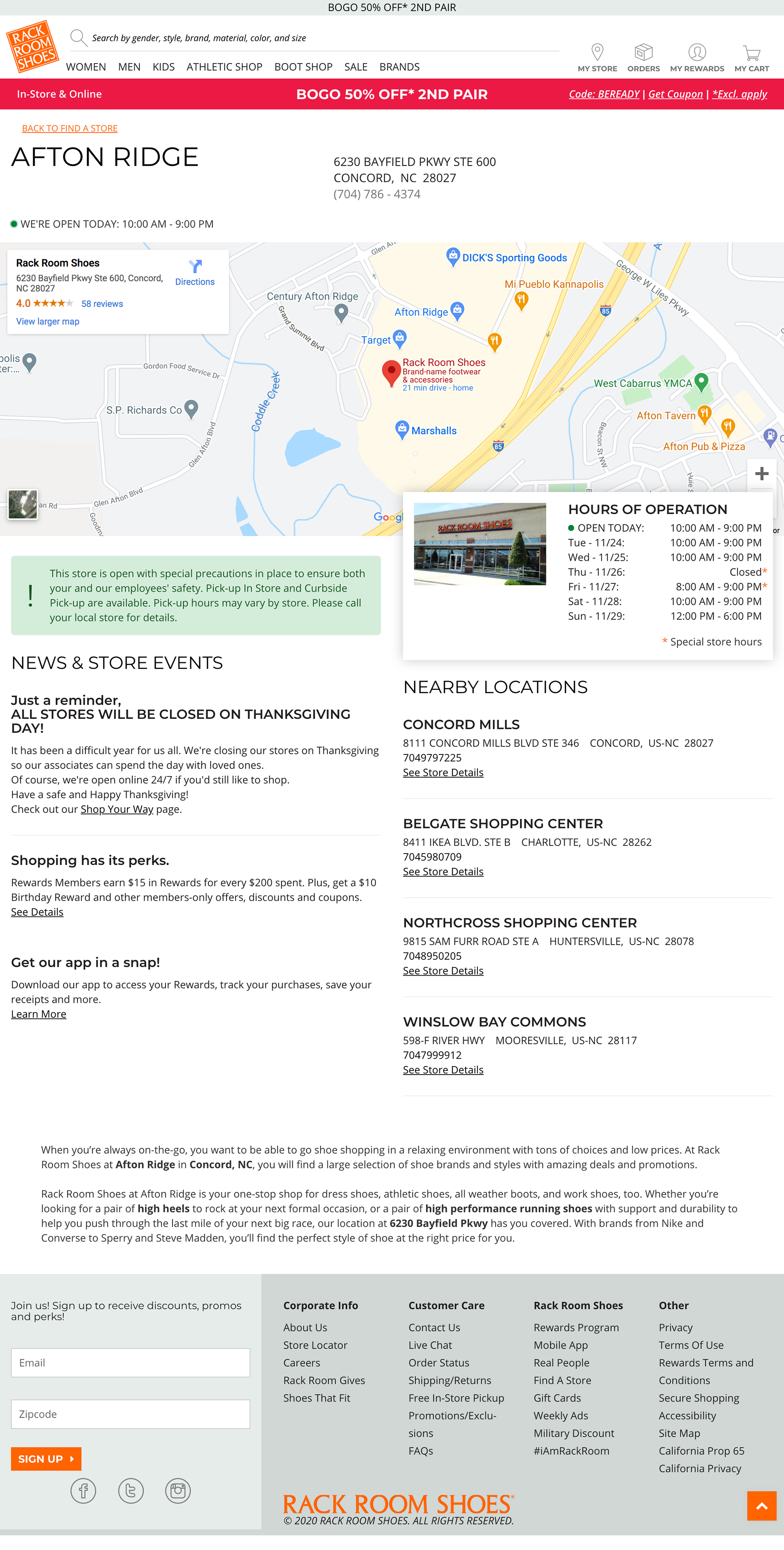
full page layout for desktop
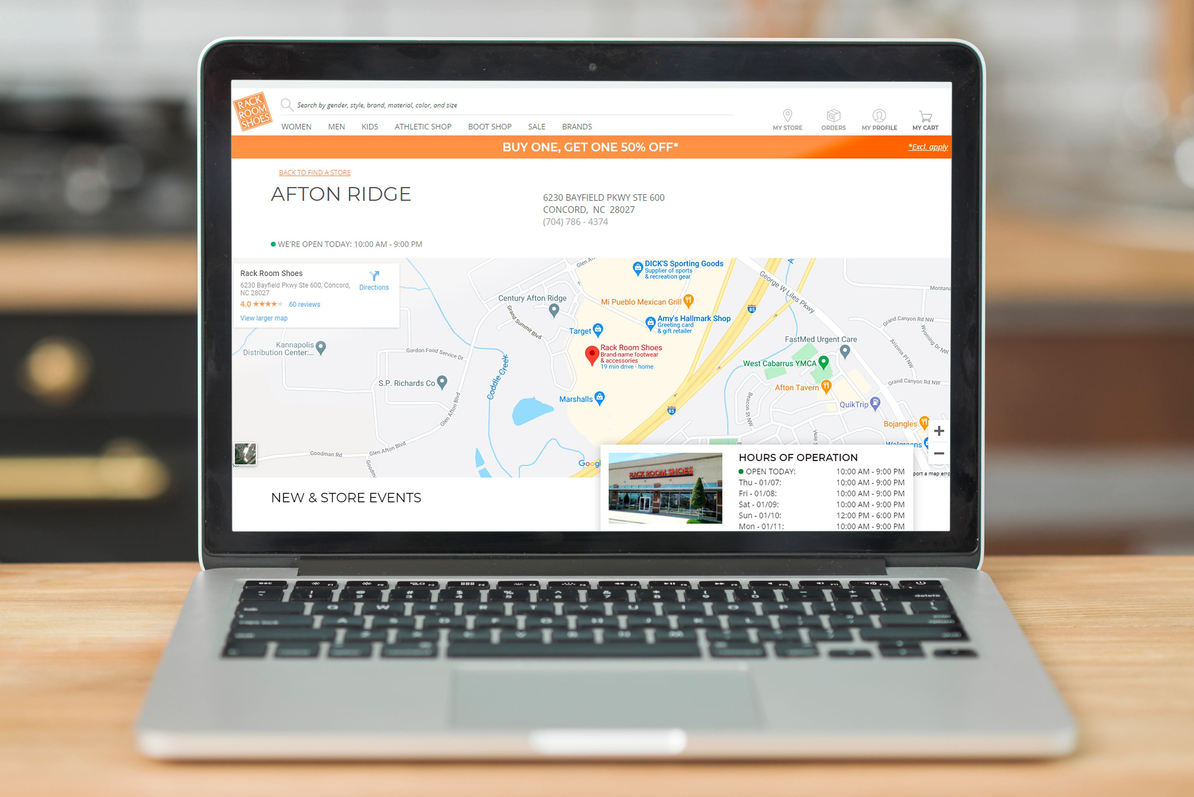
Store details page
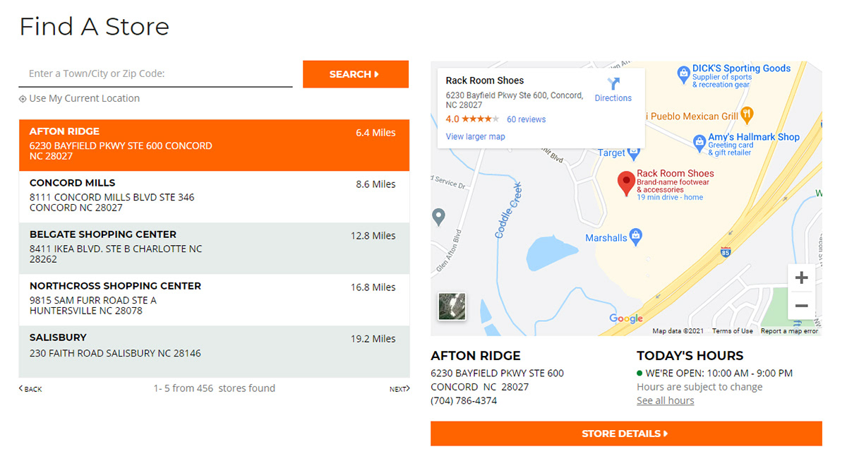
find a store full page - rack room shoes
Accomplishments
A pleasure to behold
I was extremely satisfied with how this page turned out aesthetically and the two column layout was a natural flow onto mobile devices. Store partners were also pleased with the design and the consideration for their needs.
